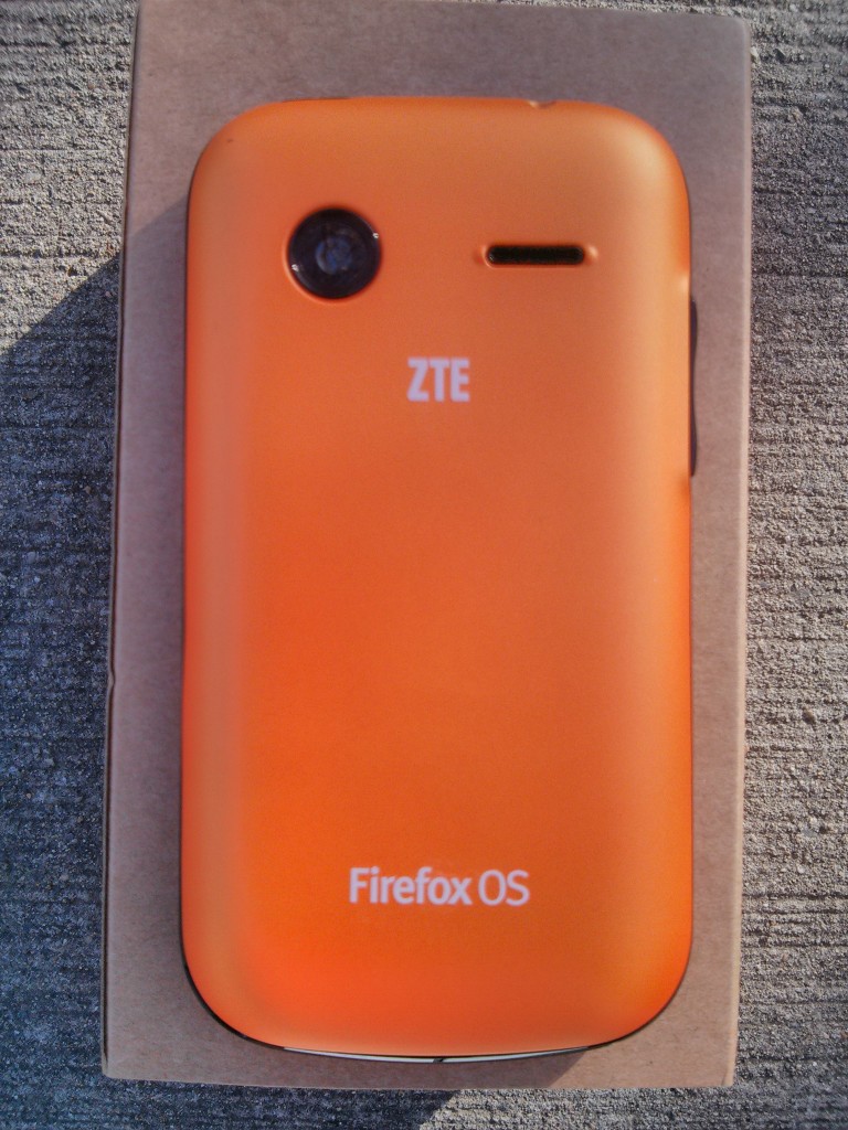
My Firefox phone arrived today! The ZTE Open is an interesting device. ZTE is selling it on ebay for ~$80. By no means is it a high end device. In theory I like the idea that developers are not running devices 7 times more powerful than their users. Targeting the emerging market only pushes down the average device’s horsepower. As a bonus this dev phone is cheap and does not require subsidization or give aways like the earlier androids or blackberry dev phones. The price itself puts it in impulse buy territory.
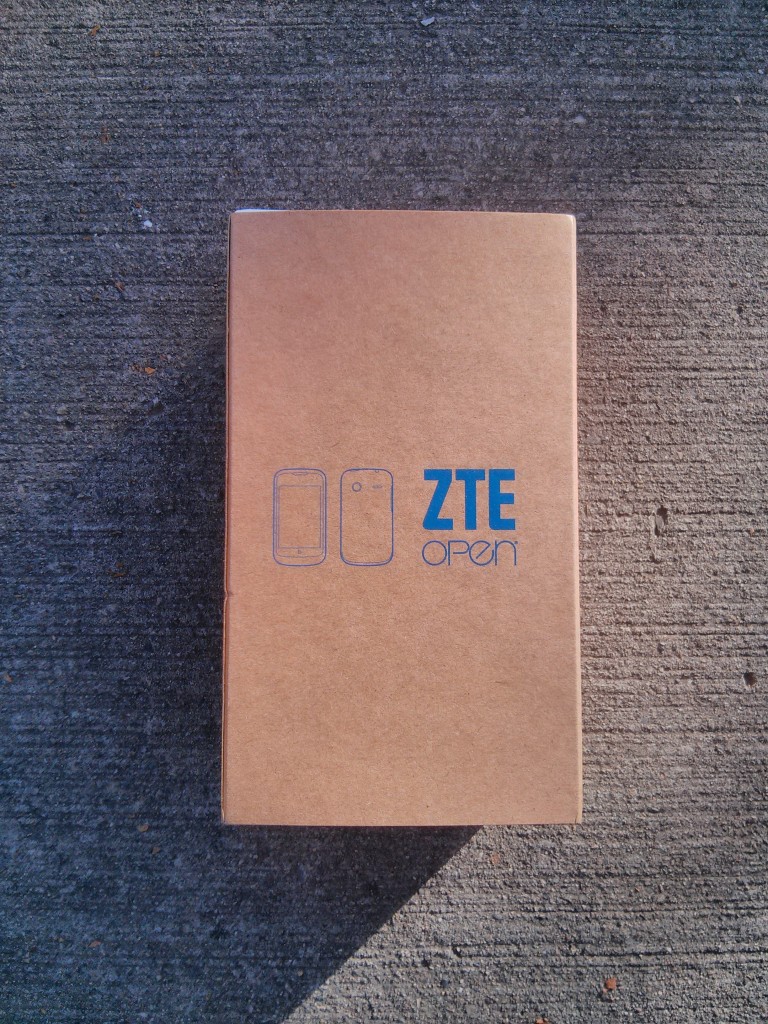
First I must admit to being struct by the box’s slipcover. The cardboard look is utilitarian and sparse.
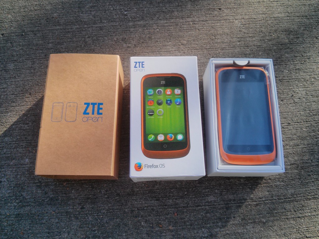
The box under the slipcover is more typical for a smartphone. I can imagine seeing this box on a retail shelf.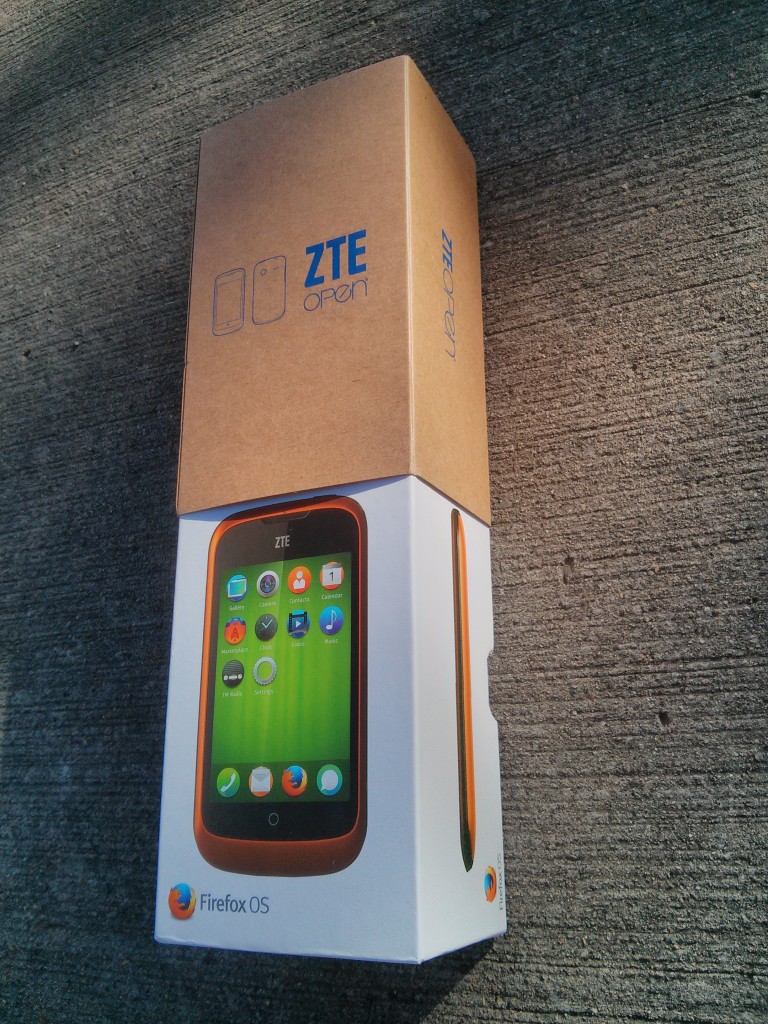
Included with the phone is a micro usb cable, headphones, and a usb charger. Without listening to them I suspect the headphones are not going to sound good. The battery is pre-inserted in the phone.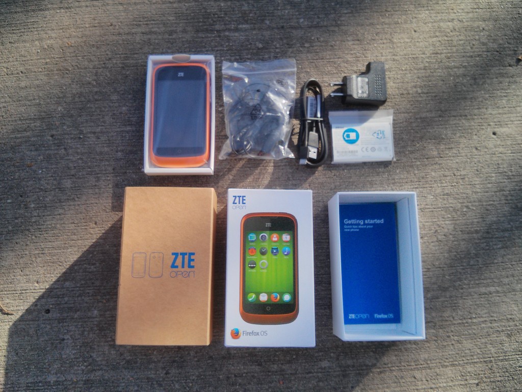
We must insert the battery which requires finding the latch in the the lower right corner. I’ve photographed the location since it was harder to find than expected. You will not feel the latch during normal usage.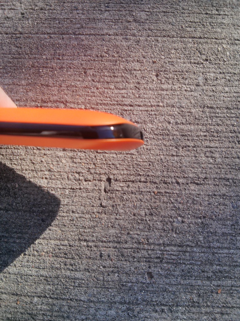
Upper left is the microSD card slot, the right is the fullsized sim slot. 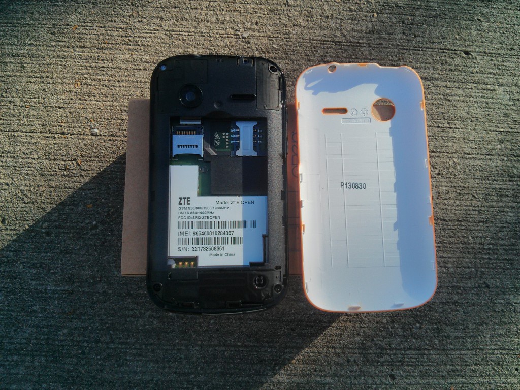
First bootup splash screen. 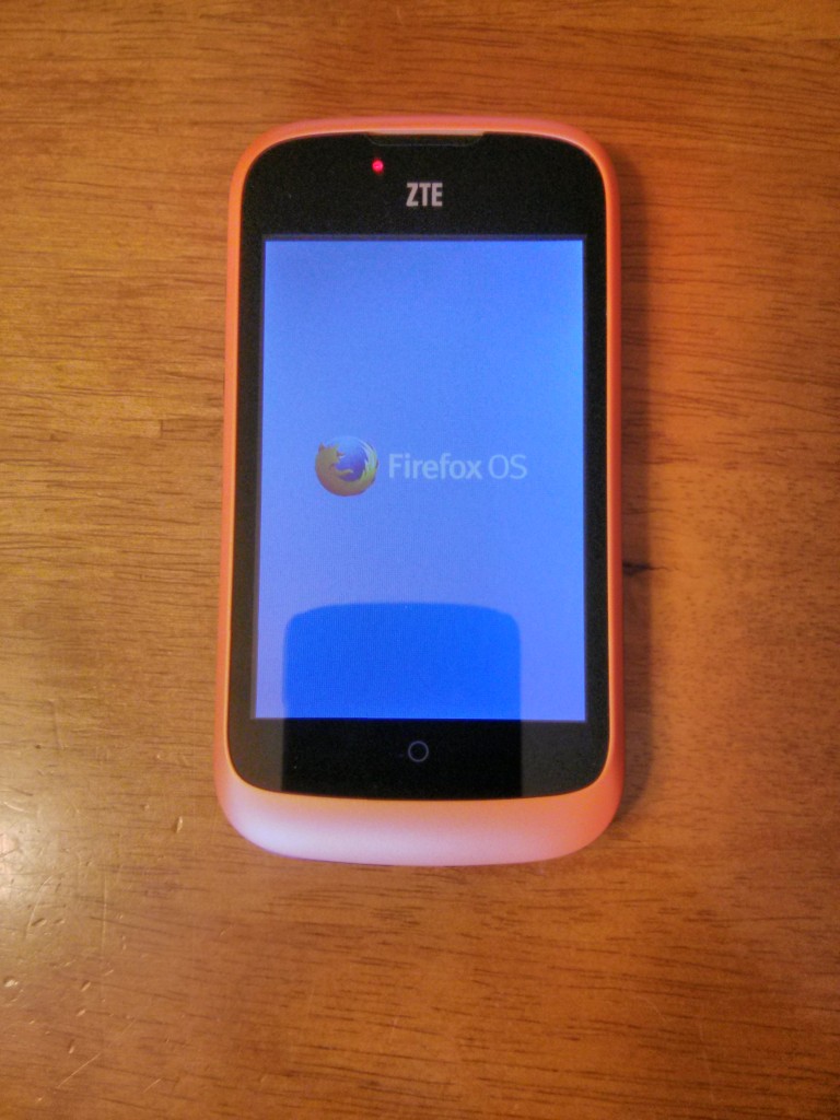
Second bootup splash screen. 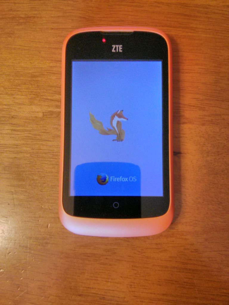
Once booted we enter the setup process. There are things I think should be changed. Please do not that this as criticism but instead as justifications for my suggestions which will find their way into bug reports.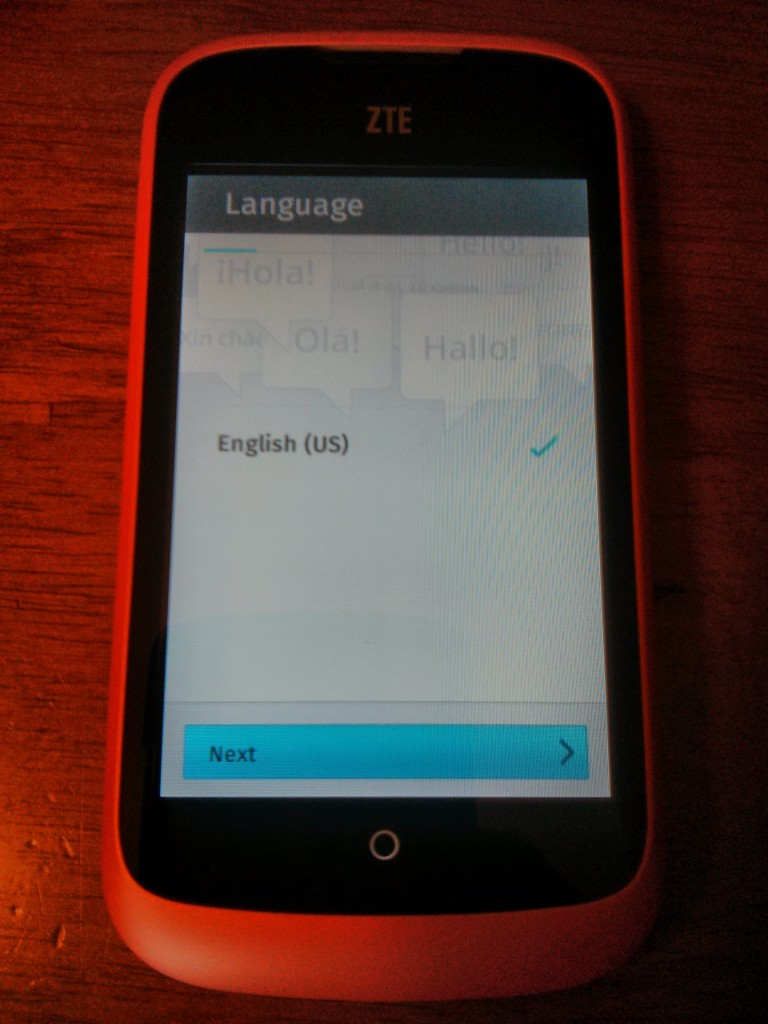
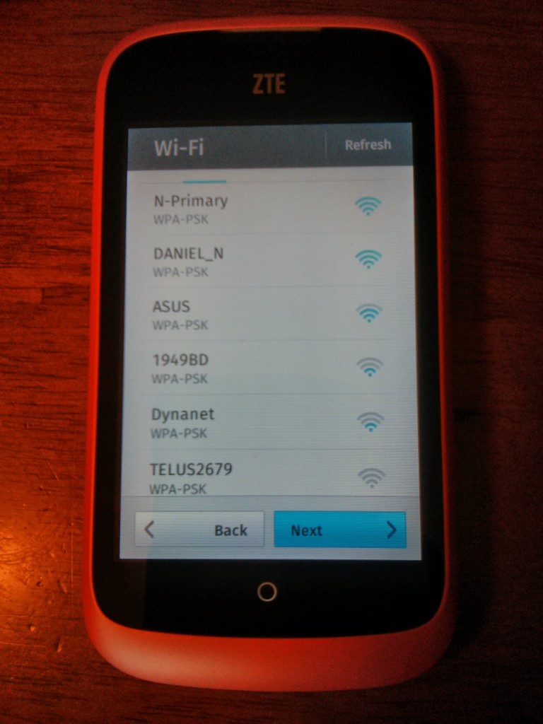
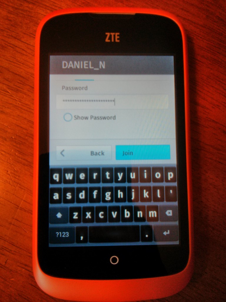
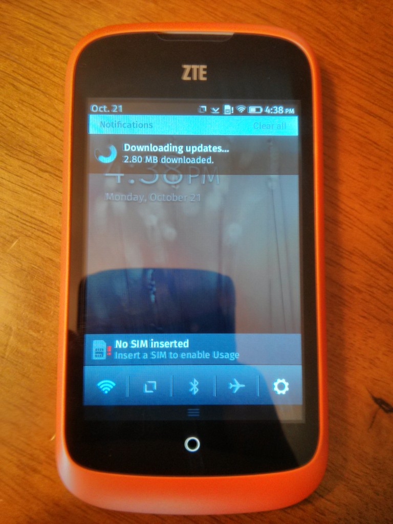
Once we’ve entered the wifi password and joined the network we’re sent back to the network select screen as shown below. This was not what I expected. I thought we’d go on to the contacts screen since we’ve done everything we can do with the wifi. 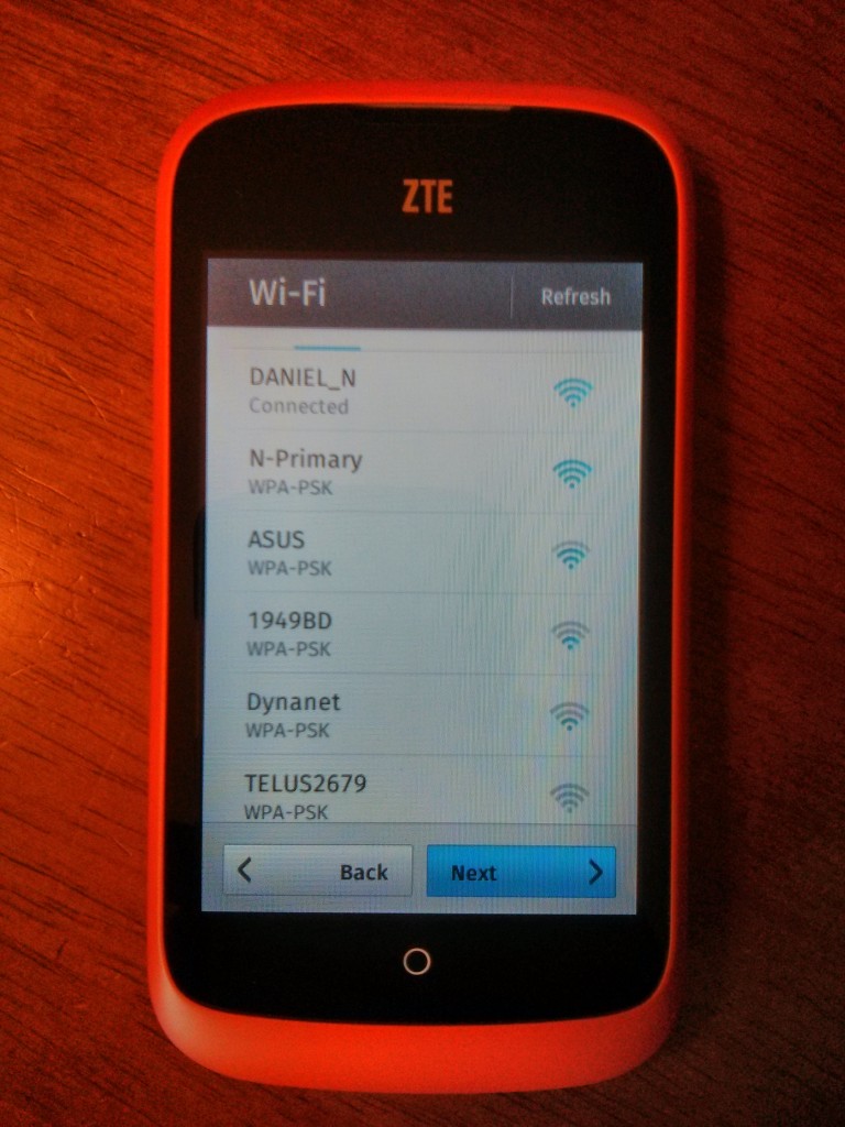
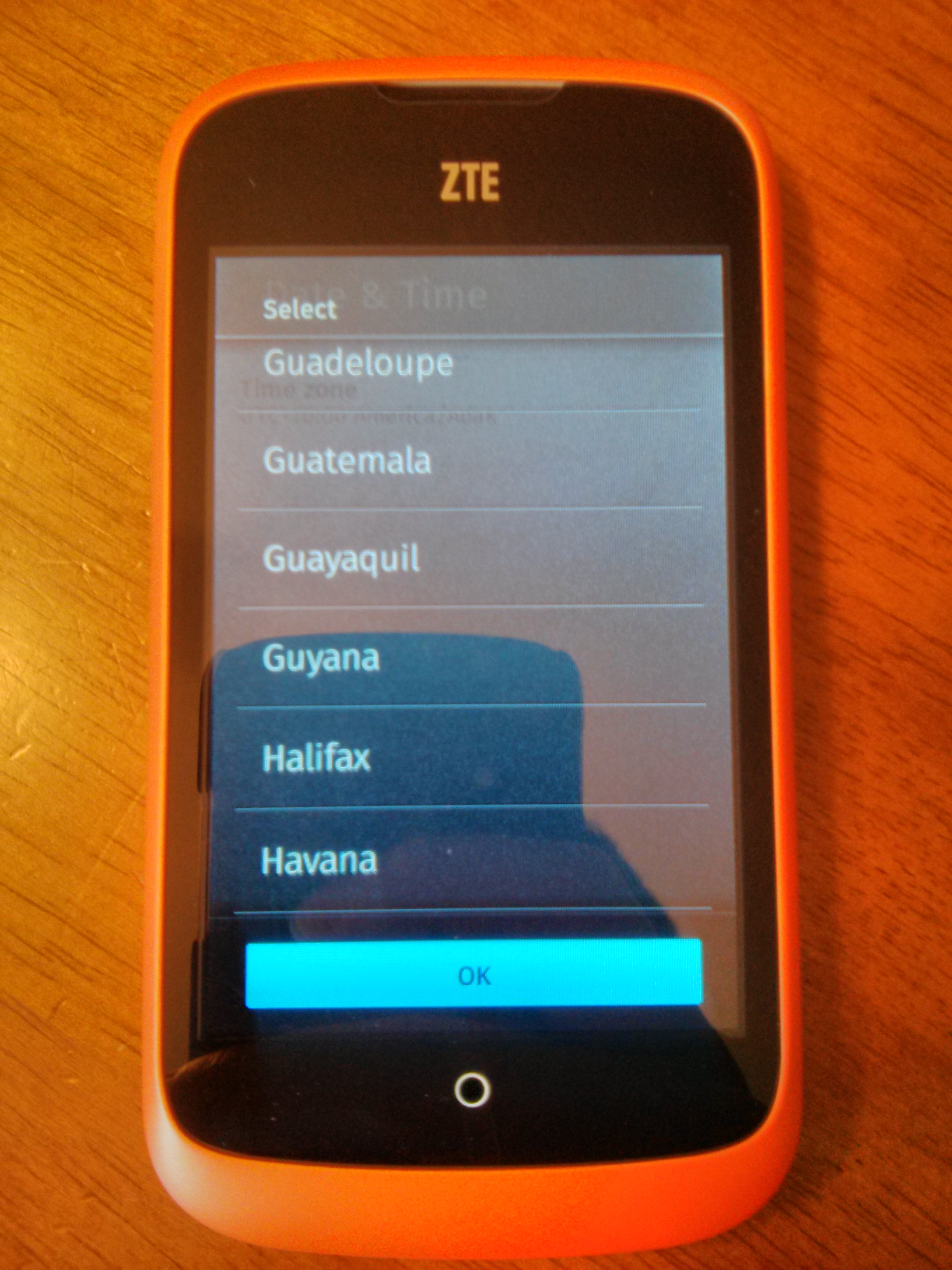
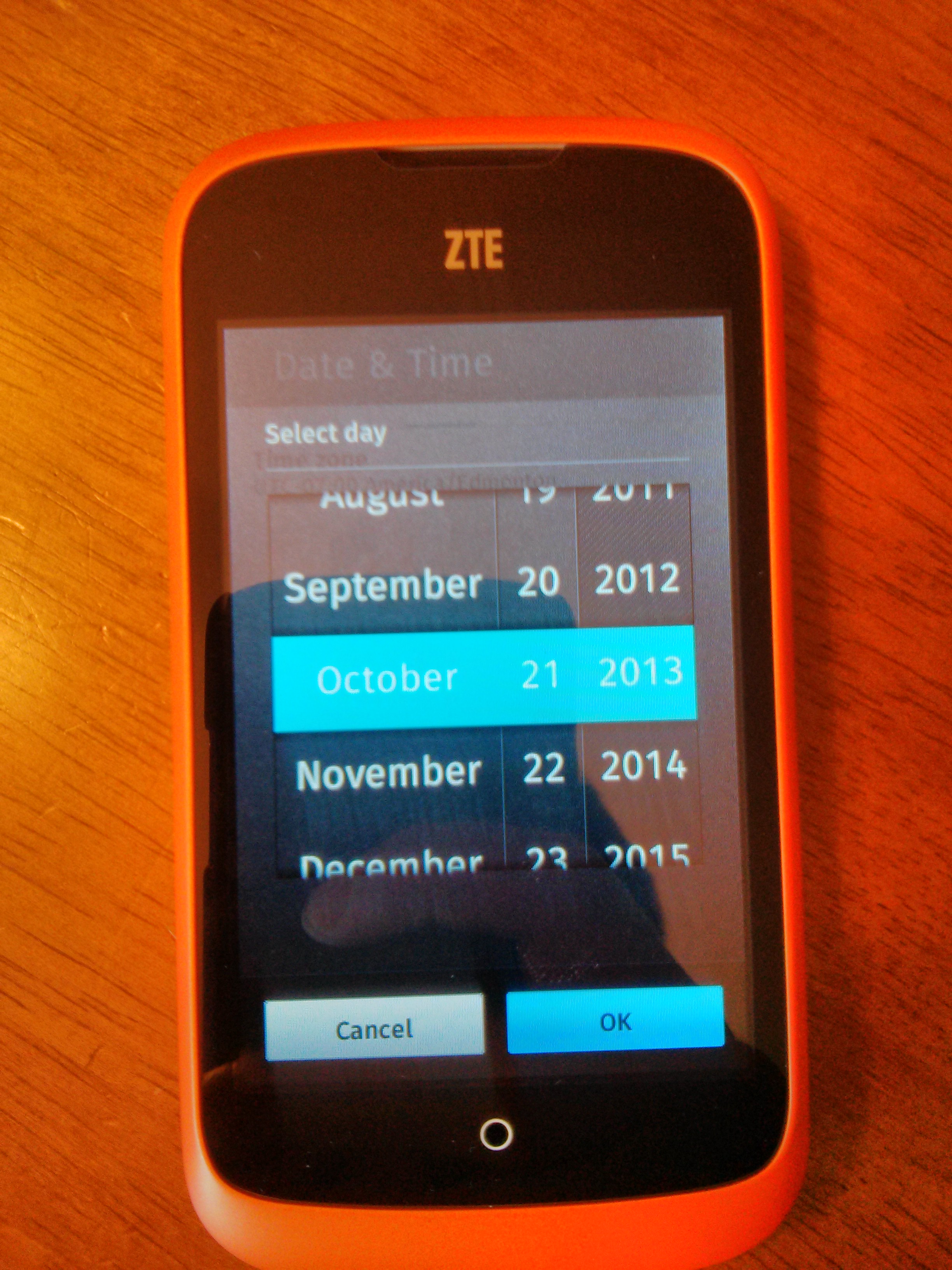
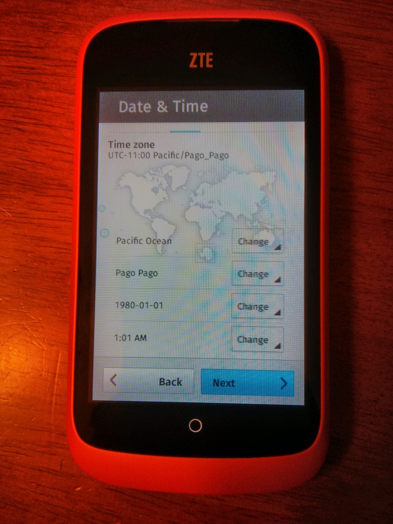
This screen is what I do not understand. We already have network access, and we’ve had minutes to initiate the GPS. I should not have to tell the phone anything of what it is asking. Notice how the time has defaulted to the epoch, unix timestamp zero. Now assuming we need this screen only as a fallback I wish we were not expected to guess what those buttons will change. It should tell me we are looking at:
- Region
- Nearest City in timezone
- Date
- Time
I bring this up because I got confused. I thought #2 meant province / state. I do not know what or where “Pago Pago” is. I thought #3 is date format. Similar to how golang defines date formatting. Instead it was the date selector.
Considering the emerging market nature of FxOS’s target market I think this risks confusion. I know that when selecting a timezone I must pick Edmonton. I know this only from installing linux several times. We cannot expect regular people to know they must select a city, which they may not live in, which must be close, but which must not be in the next timezone. To make matters worse the list is ordered alphabetically. Without knowing the exact city to select we must search through a list containing every city on our continent.
Good would be to order by location. Better would be to have them select their location on a world map. Best would would be to use our GPS if we have a signal.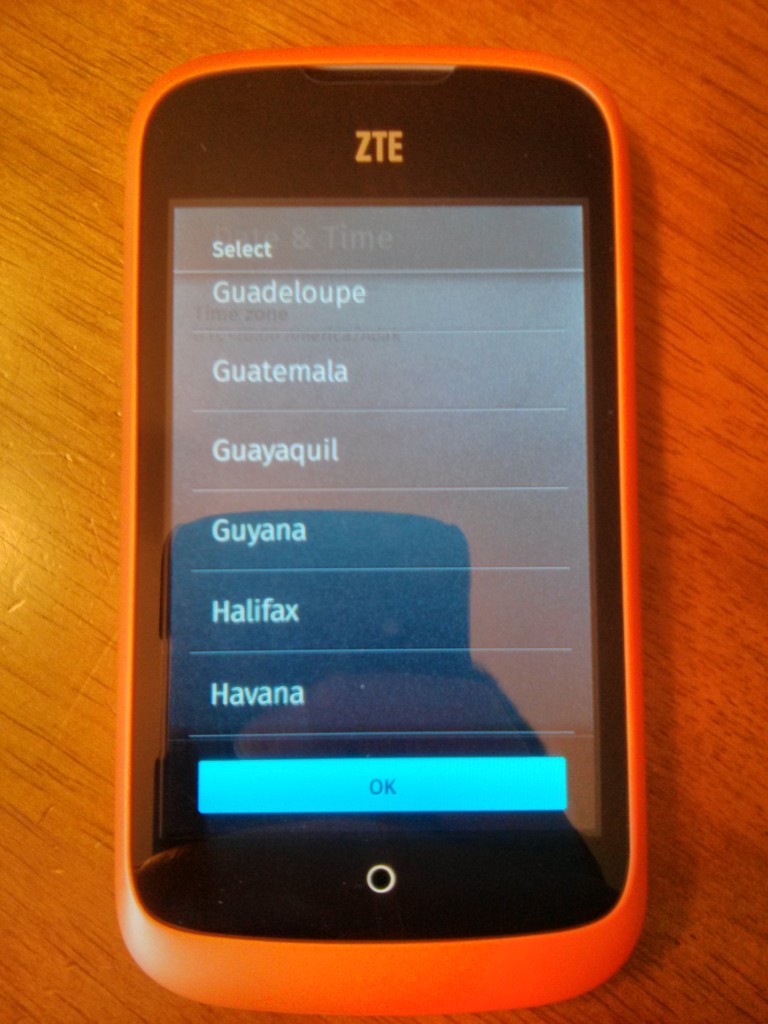
Now onto the time selector widget. This is what said time selector looks like right after we hit “change”. Notice how it knows the current date. Remember how the screen prior defaulted to timestamp zero. The phone already knows the current time!
Better would be to preset the setup screen’s time to whatever time this time selector widget thinks it is. Best would be to send off an NTP packet and get the real time over the network. Remember, we already setup the wifi connection.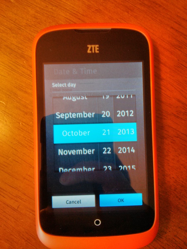
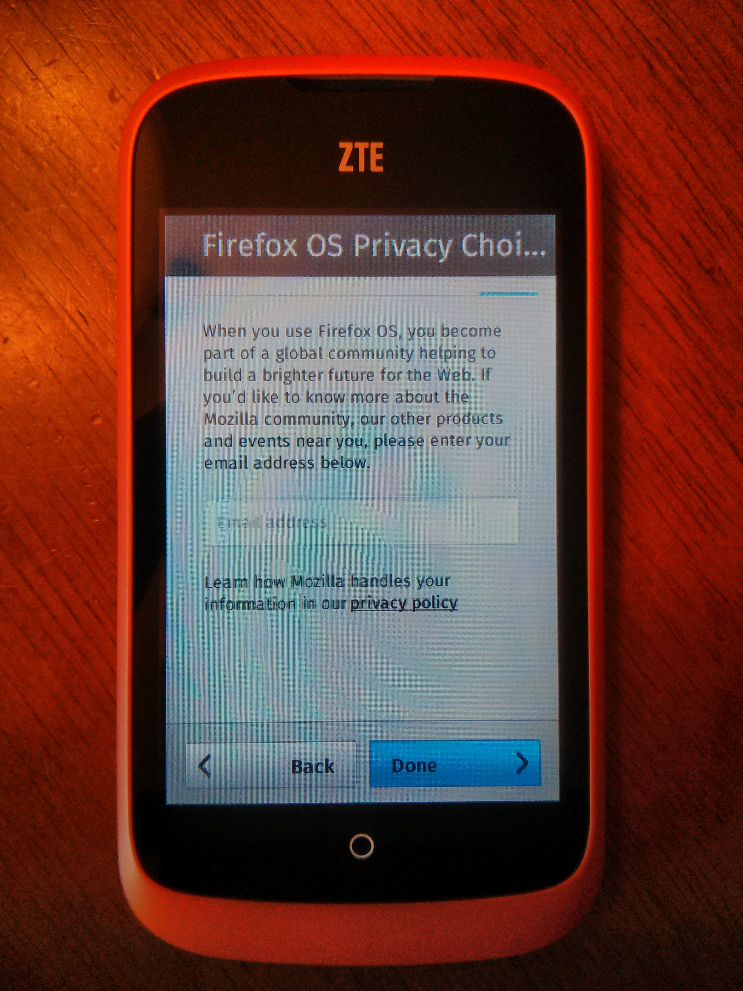
This title is too long. I had to change my app’s title to fit the app screen, this screen needs the same treatment.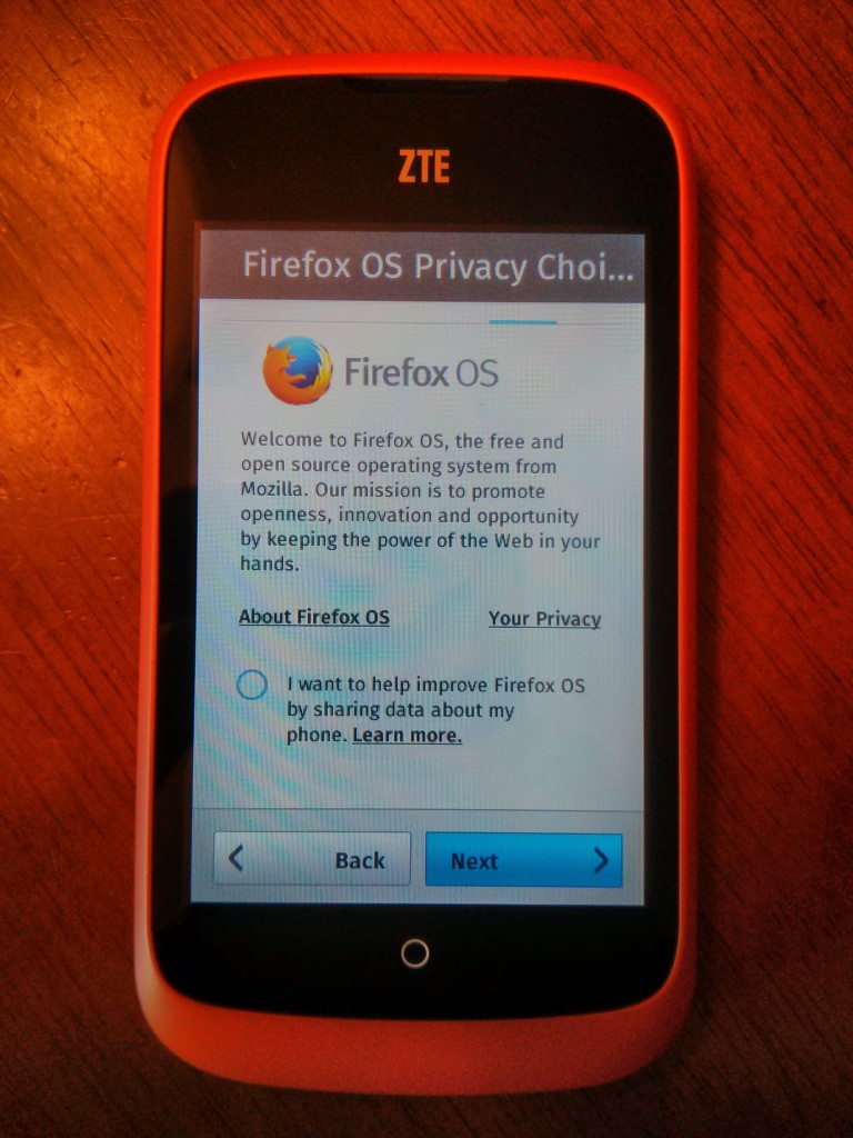
I wish something in bigger letters told me this is a newsletter signup screen. Instead I thought it was a registration screen. 
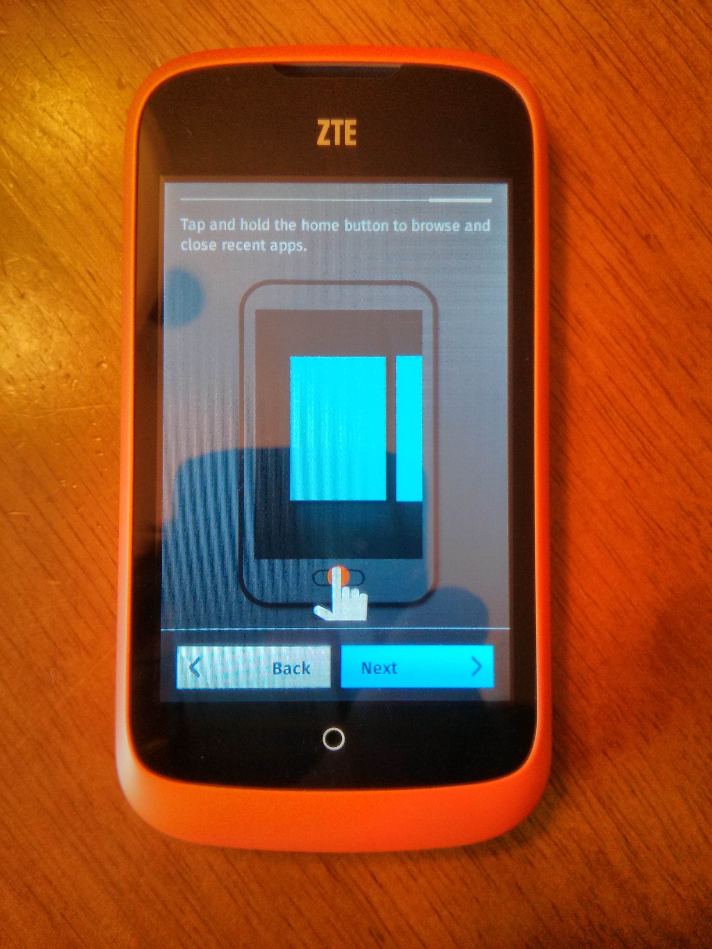
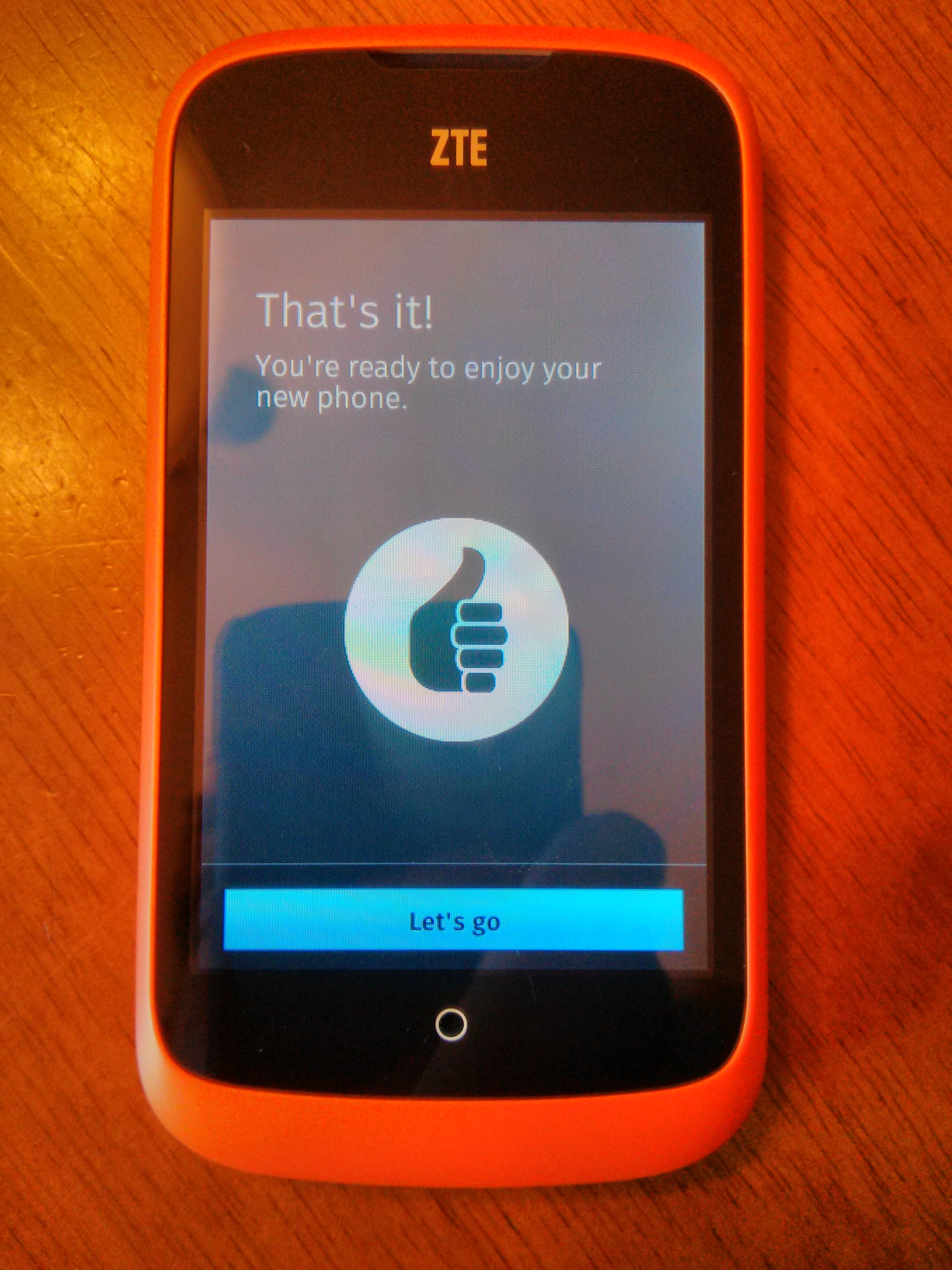
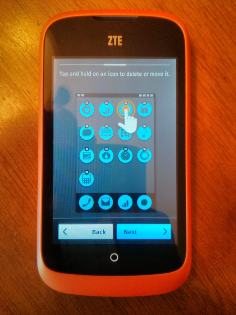
The following tutorial is good and does the job. I’m sure they would prefer a tutorial which used the real homescreen instead of the abstract images. I understand that feature is extra work on a level beyond the other suggestions. I just hope it is on someone’s todo list. 
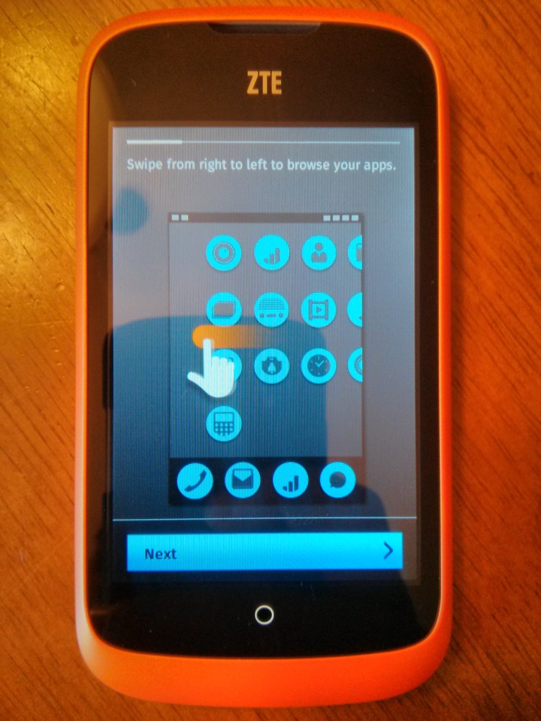
Note how it asks us to find new apps to the homescreen’s left, we will have a problem with this later. 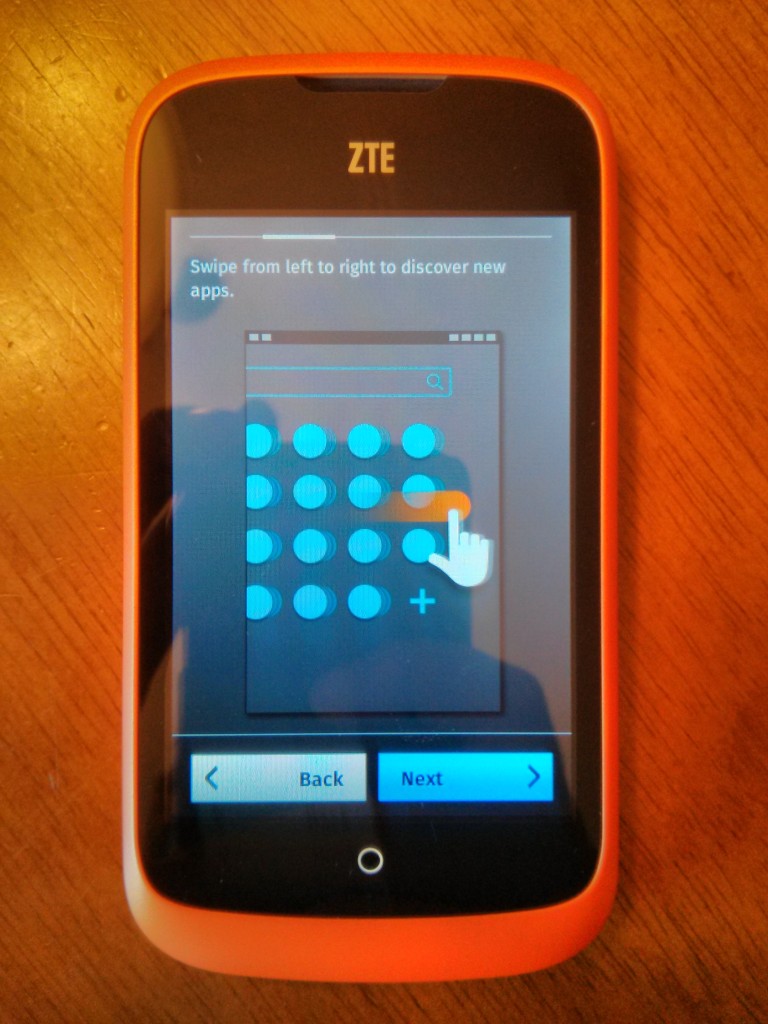
Also note how it asks us to swipe down. 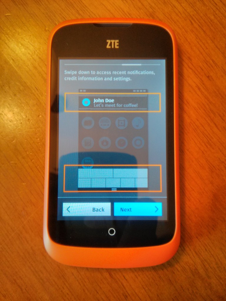


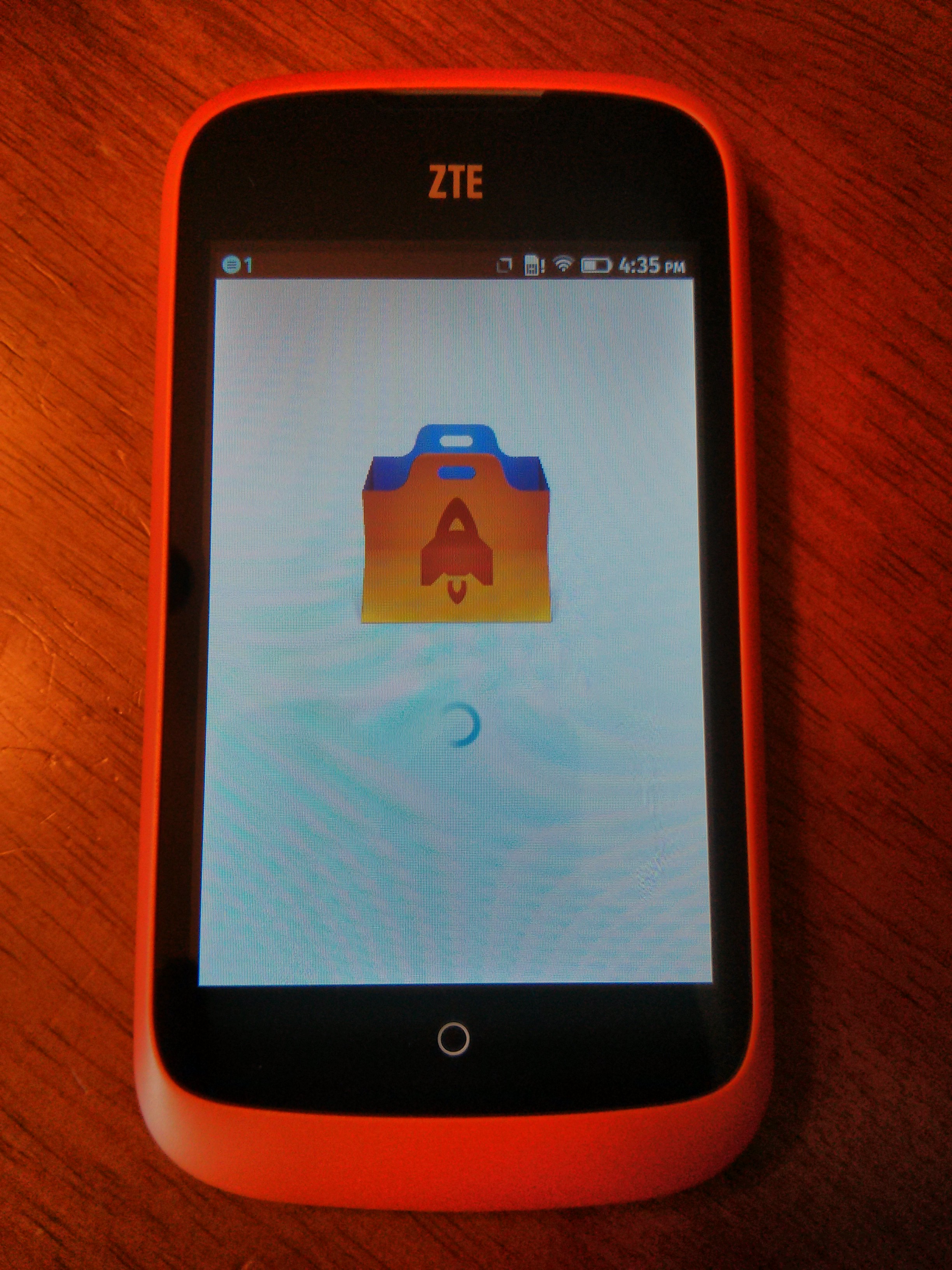
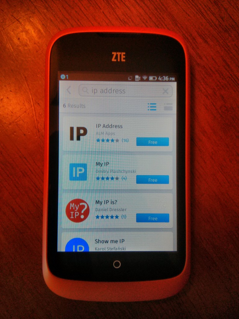
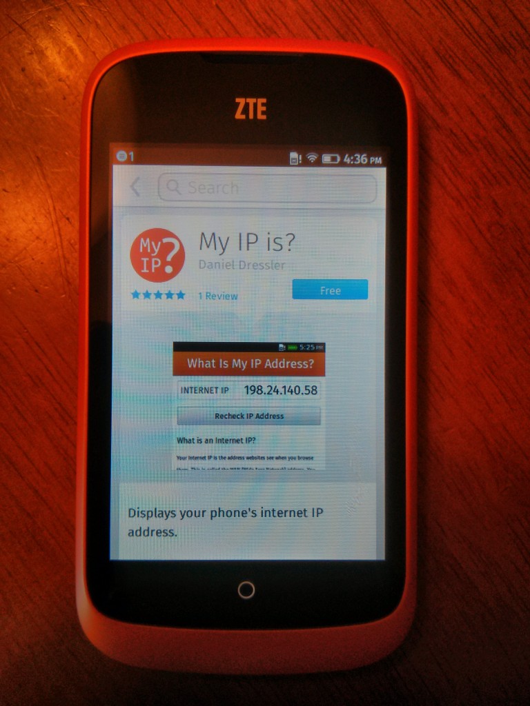
Keeping in mind the instructions we saw earlier I wanted to install the app i made a few days ago. This screen is supposed to be where one finds new apps. Yet these search results do not look like the “IP Address” apps I saw in the Firefox Market. Instead these look like website bookmarks.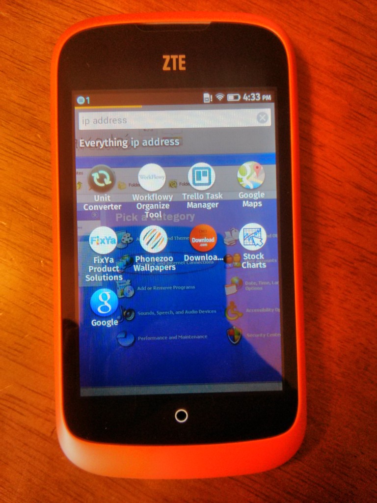
Rather we must go to the homescreen’s right where we find the Firefox appstore. And it is here we find my app. 
As we noted earlier one should be able to bring down the notification screen by swiping down from the top. Instead we must press, hold, then pull down. Swiping down without holding is interpreted as swiping left or right.
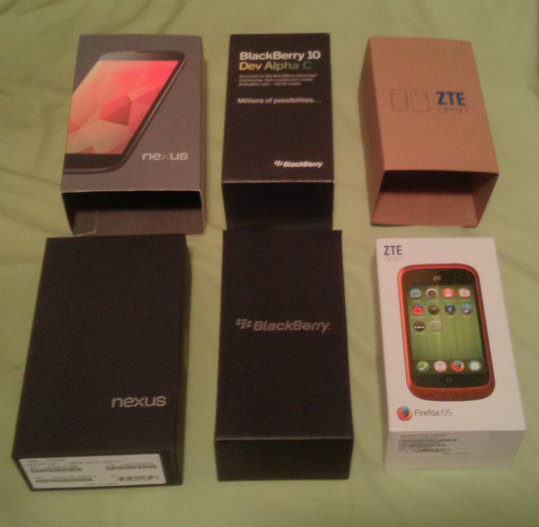
Now just for interests’ sake let us analyse the ZTE Open’s box in relation to the other dev phones I have. The Nexus 4 aims to look premium. The box is trying to convey that a $300 phone can be no less premium than the $600 competitors. The Blackberry 10 box aims to feel exclusive through the mission statement on the box. All the Blackberry dev phones are given as gifts to developers. They want you to feel honoured and inspired to develop an application.
The exact mission statement is:
Exclusive for the Blackberry Developer
Community. Not a production modal.
Evaluation unit -- not for resale.

Millions of possibilities..
By my guess the ZTE Open aims to look grassroots or atleast non-intimidating. The Blackberry mission statement is the opposite. Blackberry wants to look established and confident. ZTE Open wants to look new and promising.

To be honest I think the box achieves the goal. I do not expect FxOS to be complete. I expect it to have room for improvement and to be welcoming of my contributions. That is what FxOS needs right now, the luxury boxes can come later.